How to wear Pantone’s 2016 colors of the year
Just when I’ve begun to warm up to Pantone’s 2015 color of the year, Marsala, the time has come time for a new hue to take the crown.
The color experts at Pantone choose what they believe to best represent cultural trends, sometimes even drawing on politics or major historical events. Their color of the year is one they expect to show up not only on the runways and in home decor trends, but in the imagery that characterizes the year, such as ads and album covers.
When they announced Marsala - literally the hue of a red wine reduction - I thought to myself, are we really putting our best foot forward if our culture can be described with brownish red? I realize I’m not the biggest fan of brown in the first place. Some are, but can’t we do better?
In an unprecedented move, Pantone chose two colors this year instead of one, and to my delight the colors of the year are much cheerier. They are also easier to wear than some previously reigning non-neutral choices, such as Honeysuckle and Radiant Orchid.
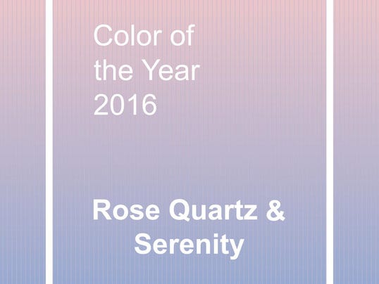
Ladies and gentlemen, introducing your two colors of the year for 2016: Rose Quartz and Serenity (or in layman’s terms, pink and blue). They were named together as a pair, and the reason behind it is pretty great. Pantone wanted to reflect a fashion world that, for the first time, is not driven by “feminine” and “masculine” pieces, and a larger societal trend toward gender equality. Together, they represent connection, wellness and peace.
I think we can all agree that this is a far superior choice than Marsala. Good riddance, sad brownish red. I don’t foresee very many people actually wearing this color pair except on a sorority sweatshirt, but below is your tutorial on how to wear them separately.
I have to say that I knew this was coming. Much as I like to leave the color-experting to Pantone, this color is on practically every wedding-related Pinterest board. There is a major renaissance of rose and blush-hued dresses, which speaks to the romantic nature of the color but also the fact that it’s not overly aggressive, like a hot pink would be.
My very favorite partner for this color is gray. Both dark and light shades of gray will work. It’s an almost-neutral outfit that is way more interesting than black and white, but it gives the same effect and is just as easy to wear. For a choice that’s a little more out-of-the-box, I like plum hues. Yes, this is effectively pink and purple, but if you dim down the purple a bit it’s very elegant.
Men should invest in a rose-colored button-down. This can be worn under your gray sweater or with your gray suit in January, and with your navy blazer and dark jeans in June.
This is kind of a fancy way of saying baby blue, but I do think the shade is deeper and richer than one you would find on your average duck blanket. It allows you to wear it as an adult, in all the seasons, rather than ironically during Easter.
This hue is perfect with dark denim. Worn with dark jeans, it serves a purpose that navy never can: It allows you to wear all blue without being totally monochromatic. Both men and women can immediately take advantage of this benefit.
For neutrals, I think shades of tan make the best partners, whether it’s a light shade like almond or a dark hue like camel. Look for this when you’re choosing the top and bottom of an outfit, but also when choosing bags, belts and shoes.
An unexpected pairing for Serenity is - you guessed it - Marsala. They actually work really well together, and now you have a 2016 use for all the stuff you bought in that color. It’s proof that fashion trends come and go, but there’s always an update waiting to happen.
read more: cheap bridesmaid dresses